Posted on

Broderie Perse

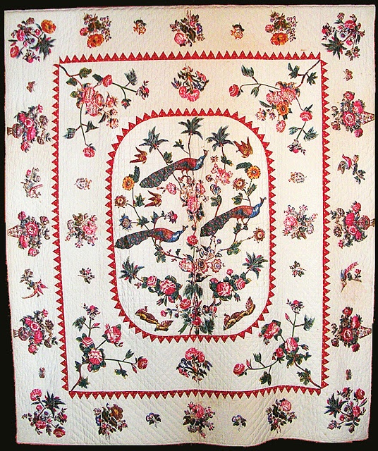
Broderie Perse is a refined appliqué technique in which printed motifs are carefully cut from one fabric and stitched onto another to create a new, often more elaborate composition. The name, meaning “Persian embroidery,” reflects the European fascination with exotic textiles in the eighteenth century, particularly the richly patterned chintzes imported from India. Though it appears painterly and spontaneous, Broderie Perse is in fact a disciplined process that combines precision cutting, thoughtful design, and meticulous handwork.

The process begins with the selection of fabric. Traditionally, quilters chose large-scale printed cottons—especially glazed chintz—featuring bold flowers, trailing vines, birds, or decorative urns. These prints were expensive, and rather than use the fabric in large uncut pieces, needleworkers maximized its beauty by isolating the most striking motifs. A contrasting background fabric, often plain or lightly patterned, is selected to allow the appliquéd motifs to stand out clearly.

Once the fabrics are chosen, careful planning of the design follows. The quilter arranges the cut motifs on the background to create a balanced and harmonious composition. Historically, wreaths, floral sprays, vases overflowing with blossoms, and central medallions were common arrangements. Although many antique pieces appear symmetrical, subtle variations in placement give the design vitality and movement. This stage is crucial: the goal is to create the illusion that the motifs were originally printed together as a single, continuous design.

The next step is fussy cutting. Using small, sharp scissors, the quilter cuts closely around each printed motif, following its contours with precision. In traditional needle-turn methods, a narrow seam allowance is left around the edge to be turned under during stitching. In contemporary adaptations, quilters may cut exactly on the printed line and use fusible web to secure the motif before stitching. Regardless of method, accuracy in cutting determines the elegance of the final result.

After cutting, the motifs are positioned and secured onto the background fabric. In traditional Broderie Perse, each shape is attached using fine slip stitches worked by hand, with the seam allowance turned under as the stitching progresses. The stitches are intentionally small and nearly invisible, preserving the illusion that the motif grows naturally from the cloth. Layering may occur at this stage; leaves might overlap blossoms, or additional buds may be inserted to fill gaps and create continuity between separate pieces.

An important artistic aspect of Broderie Perse lies in blending individual cut motifs into a cohesive whole. Quilters often adjust placement slightly, add small filler elements, or overlap edges to disguise boundaries. The objective is seamless integration—transforming isolated fragments into an organically flowing design.

Quilting completes the process and enhances the appliqué. Fine outline quilting around motifs defines their shapes, while background quilting—such as echo lines or delicate fillers—creates texture and depth. In historical examples, quilting was often restrained, framing the appliqué without competing for attention. Occasionally, additional embellishments such as embroidery were added to emphasize details or add a subtle dimension.

Historically, Broderie Perse flourished in late eighteenth- and early nineteenth-century England, France, and America. It represented both practicality and luxury: practicality in its economical use of costly printed cottons, and luxury in the elaborate compositions it enabled. Today, the technique continues to appeal to quilters who appreciate its painterly quality and its blend of historical tradition and artistic freedom.

In essence, Broderie Perse is more than appliqué; it is an act of transformation. Through deliberate cutting, thoughtful arrangement, and careful stitching, printed fabric is reimagined into a new visual narrative. The process demands patience and precision, yet rewards the maker with a composition that feels both historically rooted and uniquely personal.
Posted on

Needle Turn Appliqué

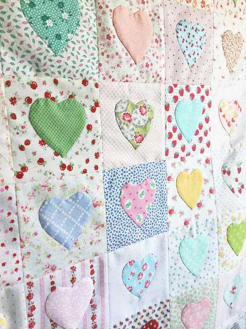
Needle-turn appliqué is a traditional hand-sewing technique in which fabric shapes are stitched onto a background fabric while the raw edges are turned under with the tip of the needle. The method produces soft, smooth edges and nearly invisible stitching, making it a favorite for heirloom quilts and fine decorative work.

The process begins with preparation. Choose a background fabric and appliqué fabric that contrast clearly so the design stands out. Pre-wash and press both fabrics to remove sizing and prevent later shrinkage. Smooth, tightly woven cotton works best because it holds a turned edge neatly without fraying excessively.

Next, prepare your design. Trace the appliqué shape onto the right side of the appliqué fabric using a removable marking tool. Add a small seam allowance—typically about ⅛ inch—around the traced line. This allowance will be turned under during stitching. Carefully cut out the shape, following the outer seam allowance line rather than the drawn design line.

Position the shape on the background fabric. You may lightly mark placement guidelines on the background if needed. Pin the shape in place or use a small amount of washable glue to secure it temporarily. Smooth the fabric so there are no wrinkles beneath the appliqué.

Thread a fine hand-sewing needle with a single strand of thread that matches the appliqué fabric. Knot the end. Begin by bringing the needle up from the back of the background fabric right at the edge of the appliqué shape so the knot is hidden underneath.

To stitch, use the tip of the needle to turn a small section of the seam allowance under, exactly along the traced design line. Hold the fold in place with your thumb. Insert the needle into the folded edge and then take a tiny bite of the background fabric directly beneath it. The stitch should be small and nearly invisible. Continue turning and stitching a few millimeters at a time, working slowly around the shape.

For outside curves, make tiny, smooth turns as you stitch. For inside curves, clip carefully into the seam allowance (without cutting past the drawn line) so the fabric can spread and lie flat when turned under. Sharp points should be stitched right to the tip before pivoting to continue along the next edge.

Throughout the process, aim for:

  • Even, tiny stitches
  • A smooth turned edge with no raw threads showing
  • Minimal tension so the background does not pucker

When you reach your starting point, secure the thread with a small knot hidden under the appliqué and clip the thread close to the fabric.

Press gently from the back once the shape is complete. A light press helps settle the stitches and smooth the edges.

Needle-turn appliqué requires patience, but it offers unmatched softness and authenticity. Because the edges are turned by hand during stitching rather than pre-pressed, the shapes retain a natural, organic look. With practice, the movements become rhythmic: turn, stitch, turn, stitch—resulting in beautifully refined appliqué that blends seamlessly into the background fabric.

Posted on

The Use of Purple in Art Quilts: Mystery, Depth, and Creative Expression

Purple is a colour rich in history, symbolism, and emotional nuance. In art quilts, it carries an air of mystery and sophistication, offering quilters a powerful means of expressing mood, imagination, and individuality. Sitting between red and blue on the colour spectrum, purple naturally blends warmth and coolness, making it both dynamic and contemplative.

Purple and Emotional Atmosphere

Purple is often associated with introspection, spirituality, and creativity. In art quilts, it can evoke a sense of quiet depth or otherworldliness, drawing viewers into a more reflective space. Soft lavender and lilac tones feel gentle and meditative, while deeper purples—such as plum, aubergine, and violet—convey richness, drama, and emotional intensity.

Because purple is less common in nature than greens or blues, its use in art quilts often feels deliberate and expressive. It signals intention, encouraging the viewer to look more closely and engage with the underlying narrative of the piece.

Historical and Symbolic Meaning

Historically, purple has been linked to royalty, power, and prestige, largely due to the rarity and cost of purple dyes. In art quilts, this association can be used to suggest dignity, legacy, or sacredness. Purple is also strongly connected to spirituality and transformation, making it a meaningful choice for quilts that explore inner journeys, memory, or change.

Symbolically, purple bridges logic and emotion, intellect and feeling. This duality makes it particularly effective in abstract or conceptual quilts, where colour carries as much meaning as form or stitch.

The Range of Purples

Purple offers an exceptionally broad range of tones and temperatures. Cool blue-violets feel calm and distant, while warmer red-violets feel lush and intimate. Muted purples—such as dusty mauve or greyed lavender—bring subtlety and sophistication, often pairing beautifully with hand stitching and textured fabrics.

Art quilters frequently explore value shifts within purple to create depth and movement. Layering light and dark purples can suggest shadow, space, or emotional complexity without introducing additional colours.

Purple as Contrast and Focus

Purple works beautifully as both a dominant colour and a dramatic accent. Against neutrals, it becomes the focal point of a composition. Paired with yellow or gold, it creates striking contrast and visual tension. Combined with blues, it enhances a sense of calm and continuity, while red accents increase its warmth and intensity.

In art quilts, even small touches of purple can elevate a composition, adding richness and unexpected depth.

Texture, Stitch, and Surface

Purple fabrics showcase texture exceptionally well. The colour’s mid-to-dark values allow quilting stitches to cast visible shadows, enhancing the tactile quality of the surface. Hand-dyed purples, batiks, and subtly mottled fabrics add complexity and interest, preventing the colour from appearing flat.

Thread choices in lighter or darker purples can either blend seamlessly or stand out boldly, allowing stitch work to become an integral part of the design.

Purple as a Unifying Element

In complex art quilts, purple can serve as a unifying thread, repeated in small areas to guide the viewer’s eye and create cohesion. Its balanced position between warm and cool colours allows it to harmonise diverse palettes with ease.

In art quilts, purple is the colour of imagination and depth. It invites contemplation, adds richness, and encourages emotional engagement. Whether used softly or boldly, purple brings a sense of intention and artistry to quilted work, transforming fabric and stitch into a powerful visual and emotional experience.

Posted on

26th South African National Quilt Festival

I am teaching!

Gqeberha | 7–11 July 2026

Join Danel Muller of Sew Awareness at the 26th South African National Quilt Festival for a hands-on, confidence-building quilting class designed to inspire, encourage, and equip quilters at the start of their creative journey.

✂️ Class Overview

  • 4 structured sessions
  • 3 essential quilting techniques
  • Construct and how to finish a complete project

This class is an ideal icebreaker for new quilters and a gentle confidence builder for anyone wanting to strengthen their foundational skills in a supportive, thoughtful environment. You’ll learn not only how to quilt, but also why techniques work—helping you quilt with greater understanding and self-assurance.

Danel’s teaching blends clear instruction with encouragement, making space for curiosity, creativity, and growth.

🌿 Why Join This Class?

  • Perfect for beginners and emerging quilters
  • Learn multiple techniques in one cohesive project
  • learn to finish what you start
  • Gain skills you can immediately apply to future quilts

📍 Venue: South African National Quilt Festival, Gqeberha
📅 Dates: 7–11 July 2026

👉 Book your place here:
https://sewawareness2026.co.za/bookings-south-african-national-quilt-festival-2026/

Posted on

The Use of Yellow in Art Quilts: Light, Energy, and Visual Emphasis

Yellow is one of the most expressive and emotionally charged colours in the art quilt palette. Associated with sunlight, warmth, optimism, and vitality, yellow brings an immediate sense of light and movement to quilted work. In art quilts—where colour is often used conceptually as well as decoratively—yellow has the power to energise a composition, direct the viewer’s eye, and communicate feeling with remarkable clarity.

Yellow and Emotional Impact

Yellow is commonly linked to joy, curiosity, and creativity. In art quilts, it can convey optimism and openness, but it can also express intensity and urgency when used in strong, saturated tones. Soft butter yellows and pale golds tend to feel gentle and welcoming, while bold lemon or cadmium yellows demand attention and create visual excitement.

Because yellow reflects more light than any other colour, it often becomes the emotional “spark” in a quilt. Even small amounts can lift a composition and shift its overall mood.

Yellow as Light and Focus

One of yellow’s greatest strengths is its ability to act as light within a quilt. Quilters frequently use yellow to suggest sunlight, warmth, or illumination, even in abstract work. A yellow shape placed among darker or cooler colours appears to glow, creating a natural focal point.

In art quilts, yellow is often used strategically rather than expansively. A single yellow accent can guide the viewer’s eye through the design, linking different areas of the quilt and creating visual rhythm. When overused, however, yellow can easily overwhelm a composition, so balance is key.

The Range of Yellow

Yellow is far more varied than it first appears. Creamy ivories and pale straw tones offer subtle warmth and work well in narrative or minimalist quilts. Golden yellows suggest richness and heritage, while greenish chartreuse tones feel contemporary and edgy. Warm ochres and mustard yellows add earthiness and depth, often bridging yellow with brown and green palettes.

Art quilters frequently explore value and temperature shifts within yellow, layering warm and cool yellows to create complexity and texture without introducing additional colours.

Symbolism and Meaning

Symbolically, yellow is associated with knowledge, enlightenment, and clarity. It has historical ties to gold, wealth, and sacred imagery, making it a powerful choice in quilts that explore themes of legacy, memory, or transformation. At the same time, yellow can also suggest caution or fragility, depending on context, allowing artists to use it with nuance and intention.

When paired with other colours, yellow’s symbolism becomes even richer. Against blue, it feels luminous and hopeful; next to green, it suggests growth and renewal; alongside black or deep indigo, it becomes dramatic and intense.

Texture, Stitch, and Surface

Yellow fabrics highlight quilting stitches beautifully, particularly when darker thread is used for contrast. The play of light and shadow on yellow surfaces enhances texture, making hand stitching and dense quilting patterns stand out clearly.

Hand-dyed yellows, marbled prints, and subtly mottled fabrics add visual interest, preventing flatness and echoing the natural variations found in sunlight and stone. These textured yellows respond especially well to layered stitching and surface embellishment.

Yellow as an Accent and Unifier

In complex art quilts, yellow is often used as an accent colour rather than a dominant one. Repeating small touches of the same yellow throughout a quilt can unify the composition and create a visual pathway for the viewer. This repetition helps balance yellow’s intensity while maximising its impact.

In art quilts, yellow is the colour of light and intention. It brings warmth, focus, and emotional energy, transforming fabric into something that feels radiant and alive. Used with care and confidence, yellow can elevate an art quilt, adding brilliance and meaning while guiding the viewer through the story stitched into the cloth.

Posted on

The Use of Blue in Art Quilts: Depth, Calm, and Creative Expression

Blue has long been one of the most powerful and evocative colours in art, and in art quilts it plays an especially compelling role. Associated with sky, water, distance, and introspection, blue offers quilters a rich emotional and visual vocabulary. Whether used softly or boldly, blue can shape mood, suggest space, and guide the viewer’s emotional response to a quilted work.

Blue and Emotional Resonance

Blue is often linked to calm, contemplation, and quiet strength. In art quilts, it can create a sense of stillness or emotional depth that invites the viewer to linger. Pale blues may evoke openness and serenity, while deeper indigos and navies suggest mystery, reflection, or even melancholy. Because of these associations, blue is frequently chosen for quilts that explore themes of memory, time, spirituality, or inner landscapes.

At the same time, blue is not limited to peaceful expression. When pushed toward intense ultramarine or electric turquoise, it can feel energetic, modern, and assertive, adding dramatic impact to contemporary quilt designs.

Blue as Space and Distance

One of blue’s most important visual qualities is its ability to recede. In art quilts, blue naturally creates a sense of depth and distance, much like it does in traditional painting. Quilters often rely on blue to suggest sky, horizon, or water, but even in abstract compositions, blue can create breathing room and spatial layering.

This receding quality makes blue an ideal background colour. It allows focal elements—whether bright appliqué, dense stitching, or contrasting colours—to stand forward, while the blue quietly supports the overall composition.

The Range of Blues

Blue offers an extraordinary range of tonal possibilities. Soft powder blues and blue-greys convey delicacy and restraint, often enhancing minimalist or narrative quilts. Mid-range blues feel familiar and comforting, while dark blues—indigo, midnight, and navy—add drama and visual weight.

Art quilters often explore subtle value shifts within blue rather than strong colour contrasts. Layering multiple blues creates movement and texture, echoing rippling water or shifting skies. These variations can be more expressive than introducing many different colours.

Symbolism and Cultural Meaning

Symbolically, blue is associated with trust, wisdom, loyalty, and protection. In many cultures, it also holds spiritual significance, often linked to the divine or the infinite. Art quilts that address heritage, faith, or emotional resilience frequently lean on blue to reinforce these themes quietly and effectively.

Blue can also suggest coolness and detachment, which some artists deliberately use to create emotional tension or contrast within a quilt. When paired with warmer colours, blue heightens their intensity and sharpens the overall visual dialogue.

Texture, Stitch, and Surface

Blue fabrics showcase quilting and stitching exceptionally well. The shadows created by stitching are clearly visible on blue surfaces, especially in mid- to dark-value fabrics. This makes blue an excellent choice when stitch work is intended to be a prominent design element rather than a subtle finish.

Hand-dyed blues, indigos, and batiks often add depth and complexity, introducing variations that mimic water, stone, or night skies. These textured blues respond beautifully to both hand and machine quilting, enhancing the tactile quality of art quilts.

Blue as a Unifying Element

In complex art quilts with many colours and techniques, blue can act as a unifying thread. Repeating a specific blue tone in different areas—through fabric, thread, or small design details—helps guide the viewer’s eye and creates cohesion across the piece.

Conclusion

In art quilts, blue is a colour of depth and possibility. It can soothe or challenge, recede or dominate, whisper or command attention. Its emotional richness and visual versatility make it an essential tool for art quilters seeking to communicate mood, meaning, and movement through cloth and stitch. When used thoughtfully, blue transforms an art quilt into a space for reflection, inviting viewers to slow down and look more closely.

Posted on

From Blocks to Binding: Discover the Joy of Quilting

Blocks to Binding

February 2026 – NEW Quilting Course

Always wanted to quilt but didn’t know where to start? This beginner-friendly course guides you through essential techniques, quilt construction, and finishing — step by step and at a relaxed pace.

✨ Learn 3 core techniques
✨ Build a quilt from start to finish
✨ Gain confidence in quilting & binding

Perfect for beginners and anyone wanting a solid foundation.

Register online: https://forms.gle/QvCGuN2X5PuNANNy6

Posted on

The Use of Green in Art Quilts: Nature, Symbolism, and Creative Balance

The use of greens in art quilts

Green holds a special place in the world of art quilts. More than a simple colour choice, it carries deep emotional, cultural, and visual meaning. For quilters—especially those working in art quilts rather than traditional patterns—green becomes a powerful design tool, capable of evoking nature, calm, renewal, and even tension, depending on how it is used.

Green as a Bridge to Nature

Green is the colour most closely associated with the natural world. In art quilts, it often serves as a visual shorthand for landscapes, growth, and organic forms. From mossy forest floors to sunlit fields and abstract botanical suggestions, green grounds a quilt in the familiar rhythms of nature. Even when a quilt is not overtly representational, green can suggest life and vitality, giving the viewer an instinctive sense of connection and balance.

Many art quilters use green as a “resting colour” for the eye. Because it sits comfortably in the middle of the colour spectrum, green allows complex compositions to breathe. It can soften strong contrasts, calm energetic piecing, or anchor bold experimentation.

Emotional and Symbolic Meaning

Symbolically, green represents renewal, hope, healing, and continuity. In art quilts that explore themes of memory, heritage, or personal growth, green can subtly reinforce these ideas without literal imagery. Pale, misty greens may convey fragility or new beginnings, while deep emeralds and olives can speak of endurance, age, and wisdom.

Green is also culturally layered. In some contexts, it symbolises prosperity and abundance; in others, it may hint at envy or imbalance. Art quilters can draw on these associations to add conceptual depth, allowing colour to communicate alongside texture and stitch.

The Many Faces of Green

One of green’s greatest strengths is its versatility. Cool blue-greens evoke a sense of tranquillity and expansiveness, while warm yellow-greens convey an energetic and alive feeling. Muted sage, khaki, and olive tones bring sophistication and subtlety, often working beautifully in quilts that rely on texture and hand stitching. Bright, acidic greens can create tension and excitement, pushing a piece into contemporary or experimental territory.

In art quilts, value shifts within green are often more important than the colour itself. Layering light and dark greens creates depth and movement, mimicking the way light filters through leaves or reflects off water. These value changes help define form, even in abstract compositions.

Green as Background and Structure

Green is frequently used as a background colour in art quilts, especially when the intention is to frame or support a focal motif. Unlike stark neutrals, green backgrounds feel alive and responsive. They can suggest space without feeling empty, making them ideal for quilts that incorporate dense stitching, appliqué, or mixed media.

Structurally, green can act as a unifying element. Repeating a particular green tone across a quilt—whether in small accents, stitching, or borders—helps guide the eye and creates cohesion, even when other colours vary widely.

Texture, Stitch, and Surface

Green fabrics often reveal texture exceptionally well. Hand-dyed greens, batiks, and subtly mottled prints echo natural surfaces like stone, bark, and foliage. When combined with quilting stitches, green surfaces become richly dimensional. Shadows created by stitching are more visible on green than on very dark or very light colours, enhancing the tactile quality of the quilt.

Many art quilters deliberately choose green when they want stitching to be seen as a design element rather than merely a functional one.

In art quilts, green is far more than a colour—it is a language. It speaks of nature and emotion, structure and softness, tradition and experimentation. Whether used boldly or quietly, green has the unique ability to hold a composition together while still allowing individual elements to shine. For the art quilter, mastering the use of green opens the door to deeper visual harmony and more expressive storytelling, stitch by stitch.

Posted on

Creating a Frame of Nothingness

How Thoughtful Presentation Elevates Quilted Art

Quilts are more than functional textiles—they are vibrant expressions of creativity, heritage, and storytelling. Exhibiting quilts with respect means showcasing them in a way that honours their makers and allows each piece’s unique features to shine. One of the most powerful methods to achieve this is by giving each quilt a “frame of nothingness”—a space around the quilt that lets it breathe and draws the viewer’s focus to its artistry.

Understanding the Importance of Space

When hung too closely together or surrounded by visual clutter, even the most stunning quilts can lose their impact. A frame of nothingness refers to intentionally leaving space around each quilt—either through physical distance on gallery walls or by using neutral backgrounds that do not compete with the quilt’s colours and patterns. This spatial buffer acts like a silent frame, helping viewers to fully appreciate the details, textures, and stories woven into each piece.

Practical Tips for Exhibiting Quilts

  • Use Neutral Backgrounds: Hang quilts against plain, light-coloured walls or draping. Avoid bold wallpaper or busy backdrops that might distract from the craftsmanship.
  • Allow Generous Spacing: Position each quilt with ample gaps on all sides. This could mean fewer quilts per wall, but each piece will command more attention and admiration.
  • Consider Lighting Carefully: Soft, even lighting helps highlight colours and stitches without creating harsh shadows or fading fabrics. Adjustable gallery lights can enhance the visual experience.
  • Eye-Level Display: Hang quilts so that the centre is at eye level for most visitors. This makes the viewing experience comfortable and respectful.
  • Minimal Mounting Hardware: Use discreet hanging systems or sleeves sewn to the back of the quilt to avoid distractions and maintain the quilt’s integrity.

Honouring the Quiltmaker’s Vision

Providing each quilt with its own “frame of nothingness” is a mark of respect for both the artwork and its creator. It signals to viewers that these textiles are worthy of contemplation and appreciation, not just functional objects. By being intentional in how we exhibit quilts, we ensure that their best features—whether intricate piecing, bold colour choices, or subtle hand-stitching—are given the attention they deserve.

In the end, a little restraint in presentation goes a long way. The quiet space around a quilt can speak volumes, allowing its story to emerge and resonate with all who have the privilege to view it.

EQA Exhibition 2024

Posted on

On your marks, get set, Quilt!

On your marks, get set, Quilt

Your Essential Guide to Quilting—From Tradition to Creative Expression

Discover the joy, heritage, and artistry of quilting in this quilting guide designed for beginners and seasoned quilters alike. On Your Marks, Get Set, Quilt! takes you on a journey through the evolution of quilting—from its practical beginnings to the vibrant, expressive craft it is today.

Quilting is more than stitching fabric together; it’s a celebration of culture, sustainability, community, and well-being. Learn how quilting preserves stories, fosters creativity, encourages reuse of materials, and offers powerful mental and emotional benefits through mindfulness and hands-on focus.

Inside this book, you’ll find:
• Clear instructions for three essential quilting techniques:
 – Traditional piecing
 – Paper foundation piecing
 – Fused appliqué
• Guidance on creating large and small blocks of the same design
• Practical solutions for assembling quilts from mixed-size blocks
• Tips for designing, planning, and constructing a quilt that feels cohesive and beautifully finished

Whether you’re starting your quilting journey or enriching your skills, this guide blends history, technique, and inspiration to help you stitch with confidence and creativity.

Ready, steady… quilt!

Get the e-book on Amazon
